Slido — Growth & Integrations
Rethinking the Integration Experience
Slido's integrations were its strongest retention lever. But only 29% of events came from them — and the instinct to fix that by making integrations more visible was wrong. I led the design programme across four touchpoints, ran a structured ideation and prioritisation process with the team, and made the calls that kept the work focused. We delivered 646k integrated events and hit the OKR.
Role
Lead Product Designer
Scope
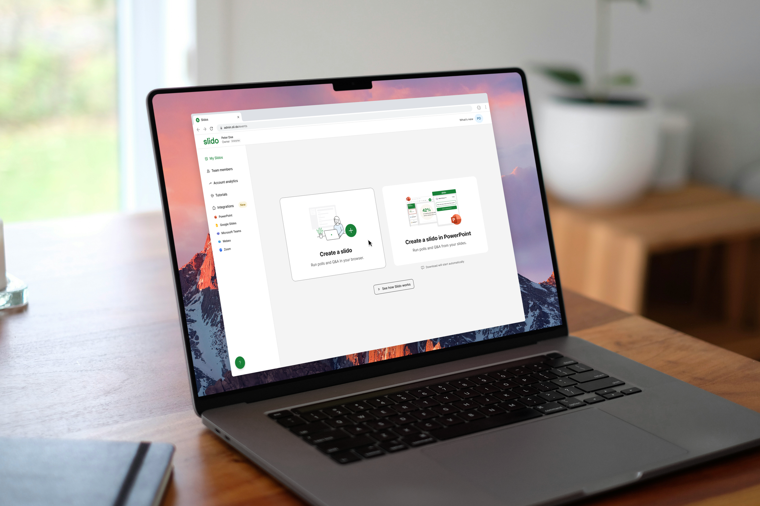
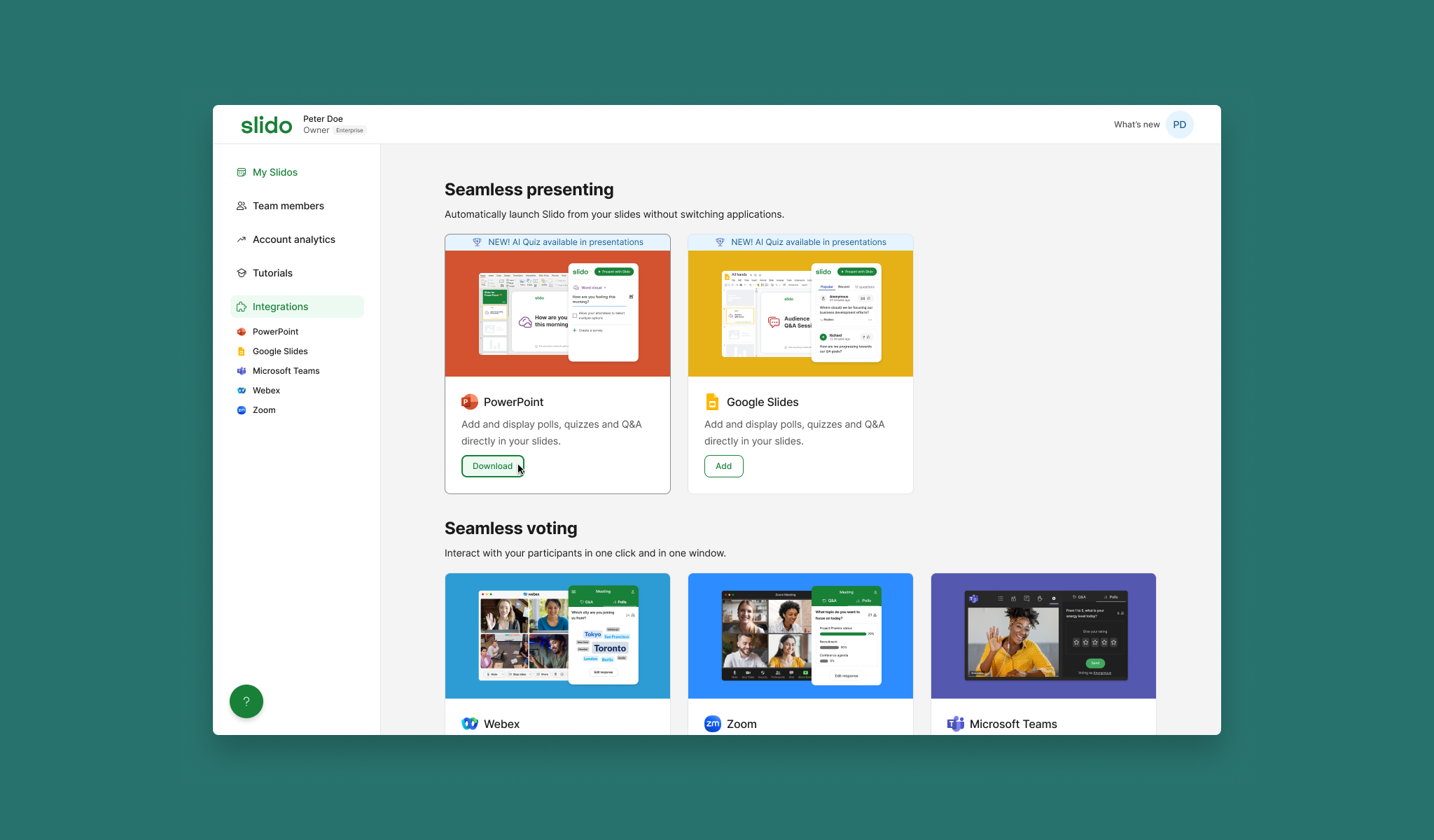
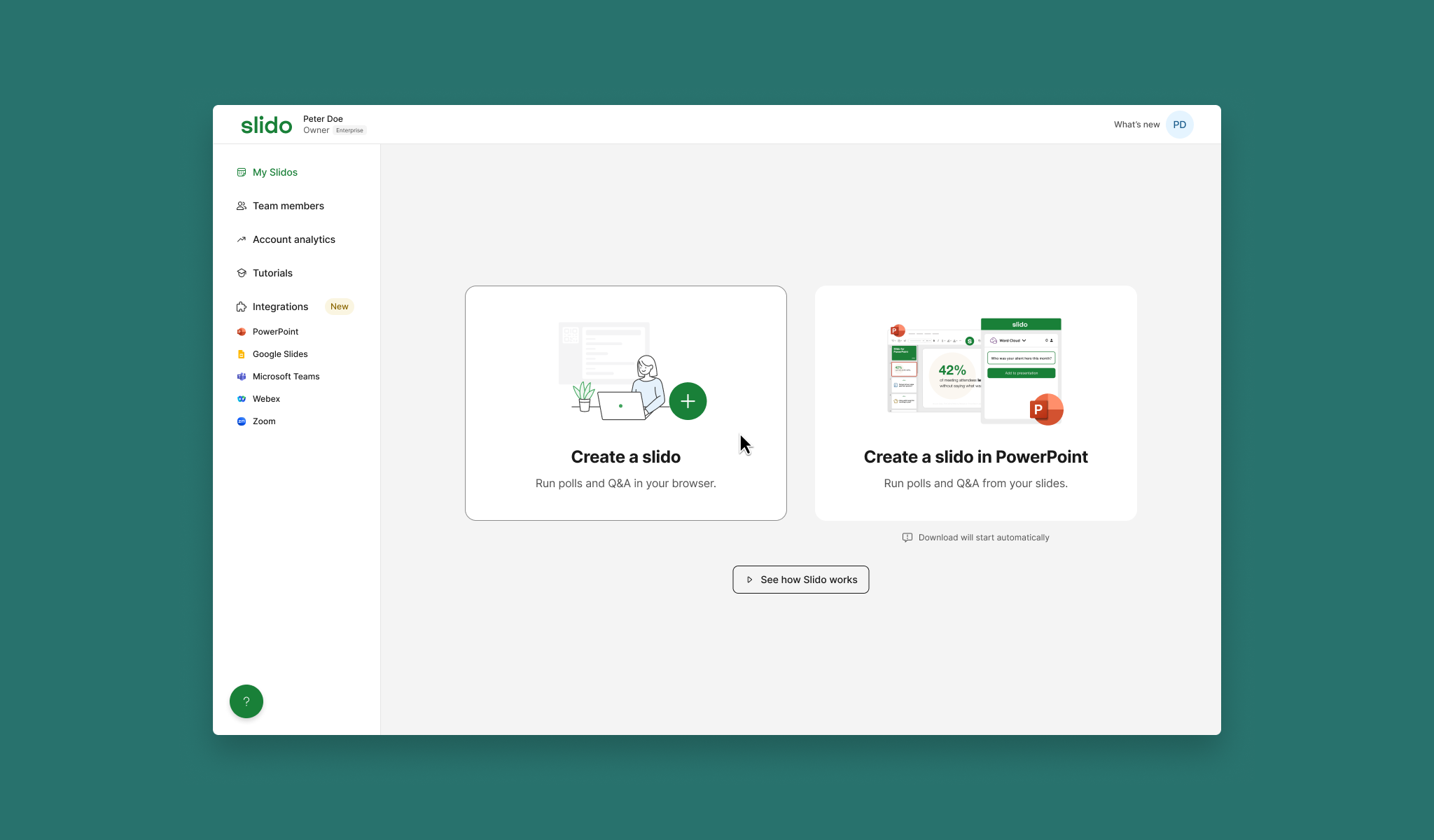
Sign-up, Marketing site, Product, PPT Integration
Company
Slido
Duration
10 months
29%
Events from integrations
At start of FY24
7%
Users discovering PPT integration through the web app
Awareness baseline
700k
Integrated events OKR target
FY24
The Problem
The obvious fix was wrong
The instinct was to make integrations more visible — surface them earlier, promote them harder. The research made clear that was the wrong starting point.
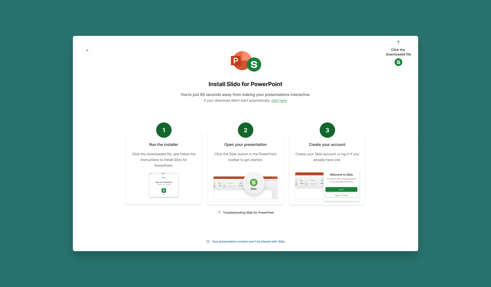
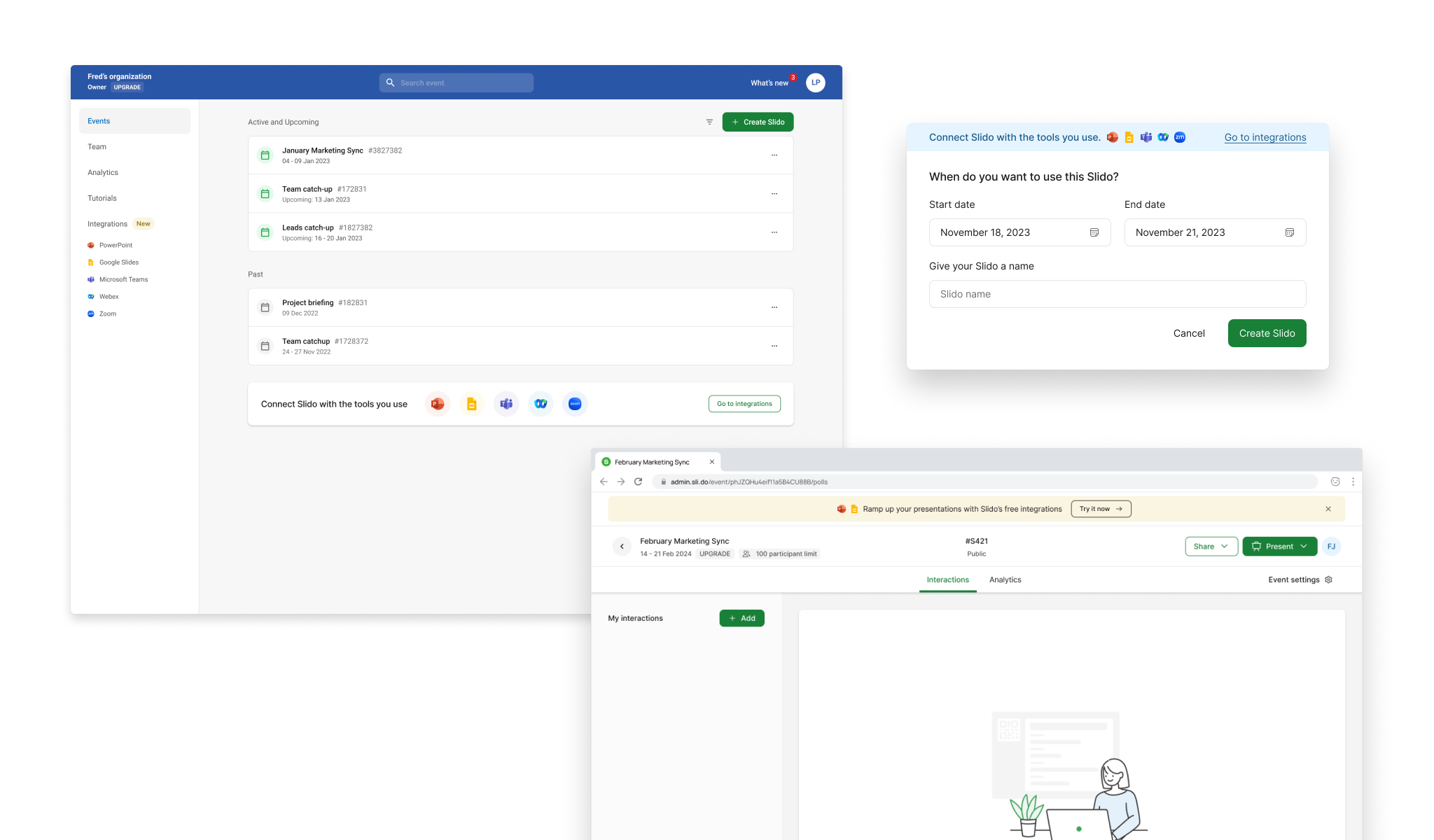
Only 25% of new customers expected to use Slido as an integration at all. Pushing the other 75% toward integrations before they understood the core product was a risk — one we later confirmed by testing. And for users who did want PowerPoint, the journey was broken in specific, fixable ways: 7+ steps across three interfaces, no feedback after the download button, an irreversible authentication error that forced a full PowerPoint restart. Twenty-seven percent of new PowerPoint integration users hit issues at setup. Some barriers — IT restrictions, firewall policies — were outside our control entirely.
The problem wasn't awareness. It was a journey that didn't meet users where they actually were.
“It’s also weird, because we jumped right back into [the marketing website] after I signed up.”
“Okay. So yeah, Powerpoint is started. And then I believe it said to look for a green button or something that’s Slido. Oh, but at this point I don’t see anything.”
“Okay, so it’s doing something here. Um, it’s downloading. I did double click twice in there. So let’s see.”
Illustration of the path to download and start using Slido in PowerPoint
Approach
Setting the direction
To generate the right ideas, I needed the team thinking about behaviour change — not features. I used BJ Fogg's behavioural design method to structure the ideation: for each of seven touchpoints across the product and marketing site, the team identified what specific actors could do differently, under what conditions, and how often. That framing kept the session grounded in real user behaviour rather than abstract product improvements.
The session generated 170 ideas. I then ran the crispification step Fogg prescribes — reformulating each idea as a precise behaviour statement with a named actor, action, and frequency. Vague ideas either sharpened into something testable or fell away. 51 made the cut. We prioritised on effort and impact, and I sequenced the programme deliberately: fix the broken foundations first, then test the higher-risk bets.
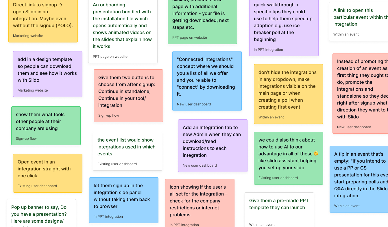
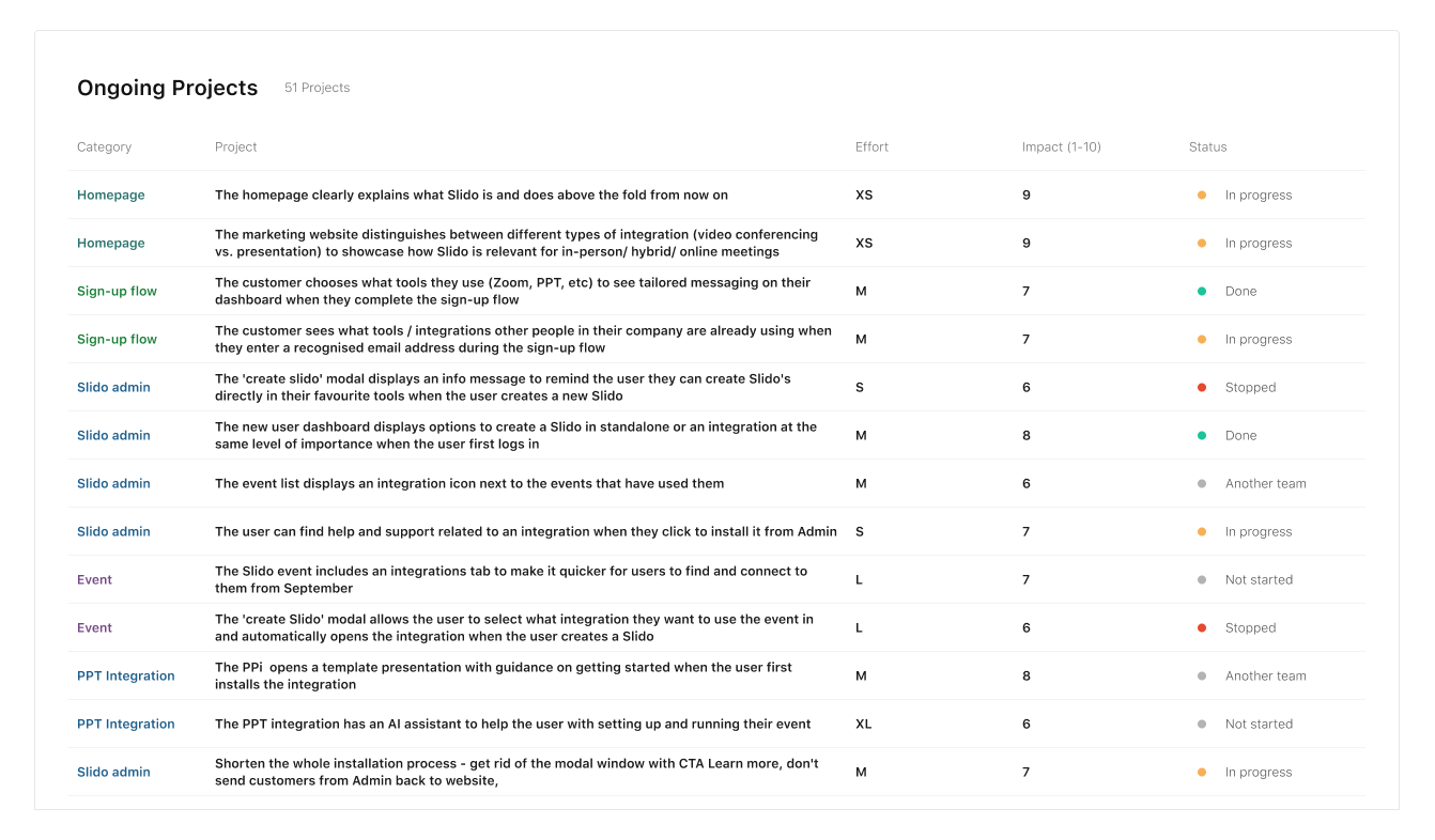
From 170 ideas across seven touchpoints to 51 prioritised initiatives — structured to fix foundations before testing direction changes.
What we tested
Four interventions moved the numbers. Each came from a specific insight — not from making integrations more prominent, but from removing the right friction at the right moment.
+22.2%
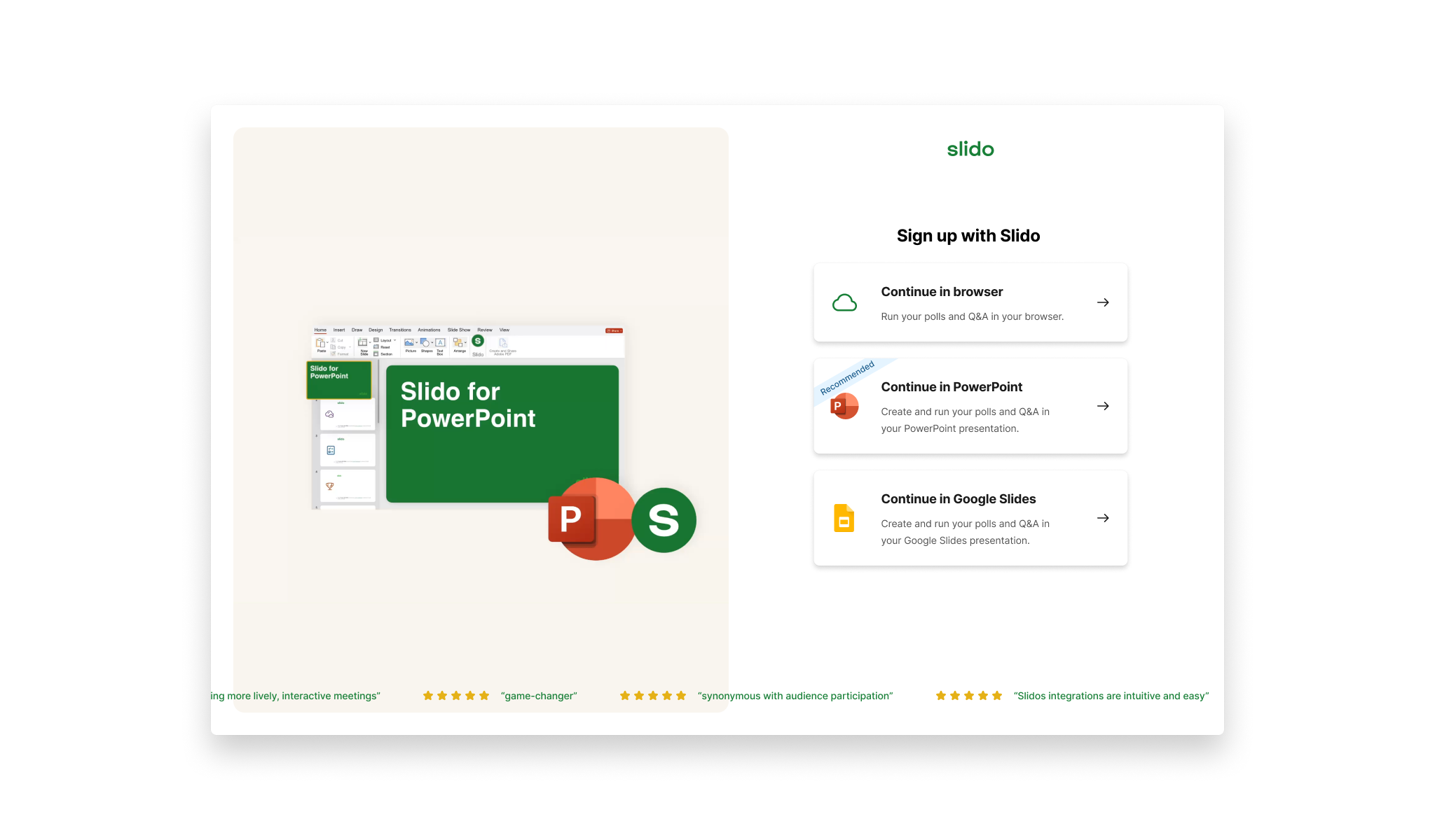
Sign-up flow
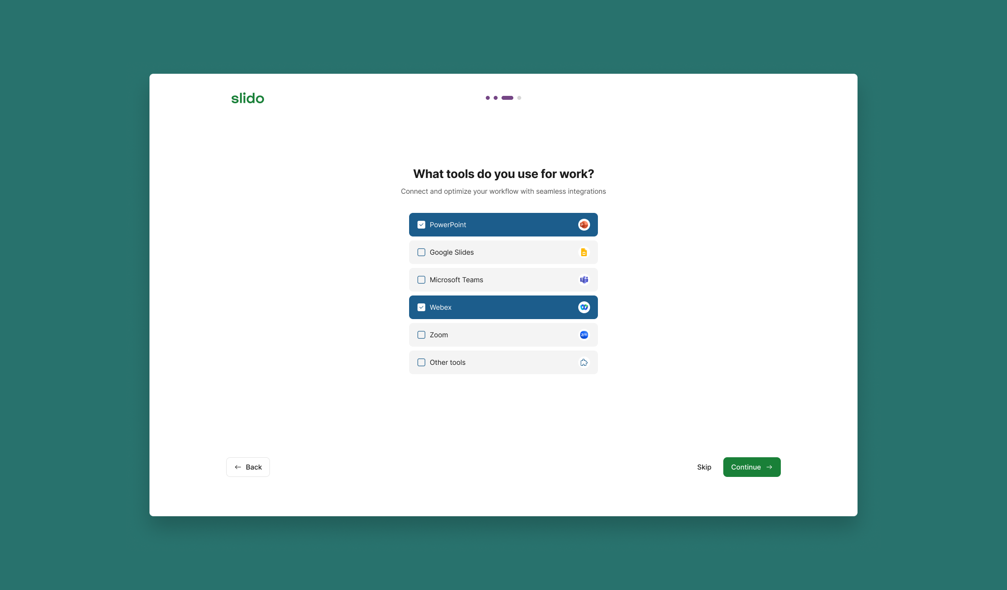
Asked new users which tools they used to tailor their dashboard. Four iterations to get there — from tiles to checklist format.
+5.4%
Integrations list page
Richer context and direct CTAs on each tile. +2.8% uplift in logins, +5.4% uplift in connected events.
+10.7%
New user dashboard
Two choices on login: browser or integration. Earlier personalisation attempts failed because they were too complex. This worked because it wasn't.
↑
PPT downloader modal
Step-by-step installation guidance addressing the specific anxiety the research had surfaced. Improved completion rates for PowerPoint activation.
What we stopped
The most important decision wasn't something we shipped
Stopped
Pre-signup integration screen
Routing new users directly into an integration before they'd experienced Slido standalone seemed like the most direct path to the OKR. The data told a different story.
+1,120
New signups in integrations
−3,200
Total signups lost
Stopped
Aggressive in-product promotion
Banners and prominent integration messaging across the product. Users ignored them or were put off entirely.
The simplest placement — integrations in the navigation — outperformed everything more prominent. Counterintuitive enough that it needed the test to land. That finding shaped the rest of the programme.
Outcomes
What changed
646k
Integrated events in FY24
OKR hit — considered a success
32.2%
Of all events from integrations
Up from 29% at start of year
22.2%
Uplift in multiple tool selections
Sign-up flow improvement
Integrations list page
+2.8% uplift in integration logins. +5.4% uplift in connected events. Richer context and direct CTAs on each tile removed the step between interest and action.
Dashboard personalisation
+10.7% uplift in events created via integrations. +13.4% uplift in used integrated events. Earlier, more complex personalisation attempts had failed — the simpler version succeeded.
Push for more ambitious concepts earlier
The programme settled into incremental testing earlier than it should have. Some of the highest-potential ideas from the ideation session were technically complex and got deprioritised in favour of quicker wins. A longer runway and earlier engineering alignment would have changed what we could attempt.
Reflection
What this reinforced
What this project reinforced
Working across four touchpoints simultaneously — marketing site, standalone product, and two integrations — meant every decision had to account for where a user was in their full journey, not just the screen in front of them. That end-to-end scope is where the interesting problems actually live.