EY Seren — Enterprise Intranet Redesign
Redesigning a Global Digital Workplace for 250,000 Employees
EY's intranet was fragmented and widely criticised. I led the redesign from gap analysis through information architecture, search definition, and design direction, turning a platform employees resented into one they took pride in.
Role
Lead Product Designer
Scope
IA, Search, UX/UI, Design Direction
Company
EY Seren
Duration
8 months
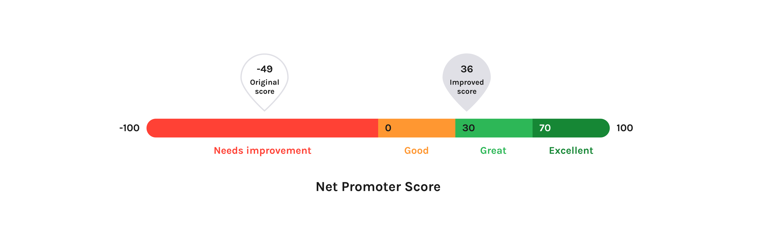
-49
Employee NPS before redesign
"Needs improvement"
40%
Task success rate in existing IA
Baseline before intervention
10+
Separate regional intranets
Fragmented, duplicated, inconsistent
The problem
Fragmented, criticised, and failing 250,000 people
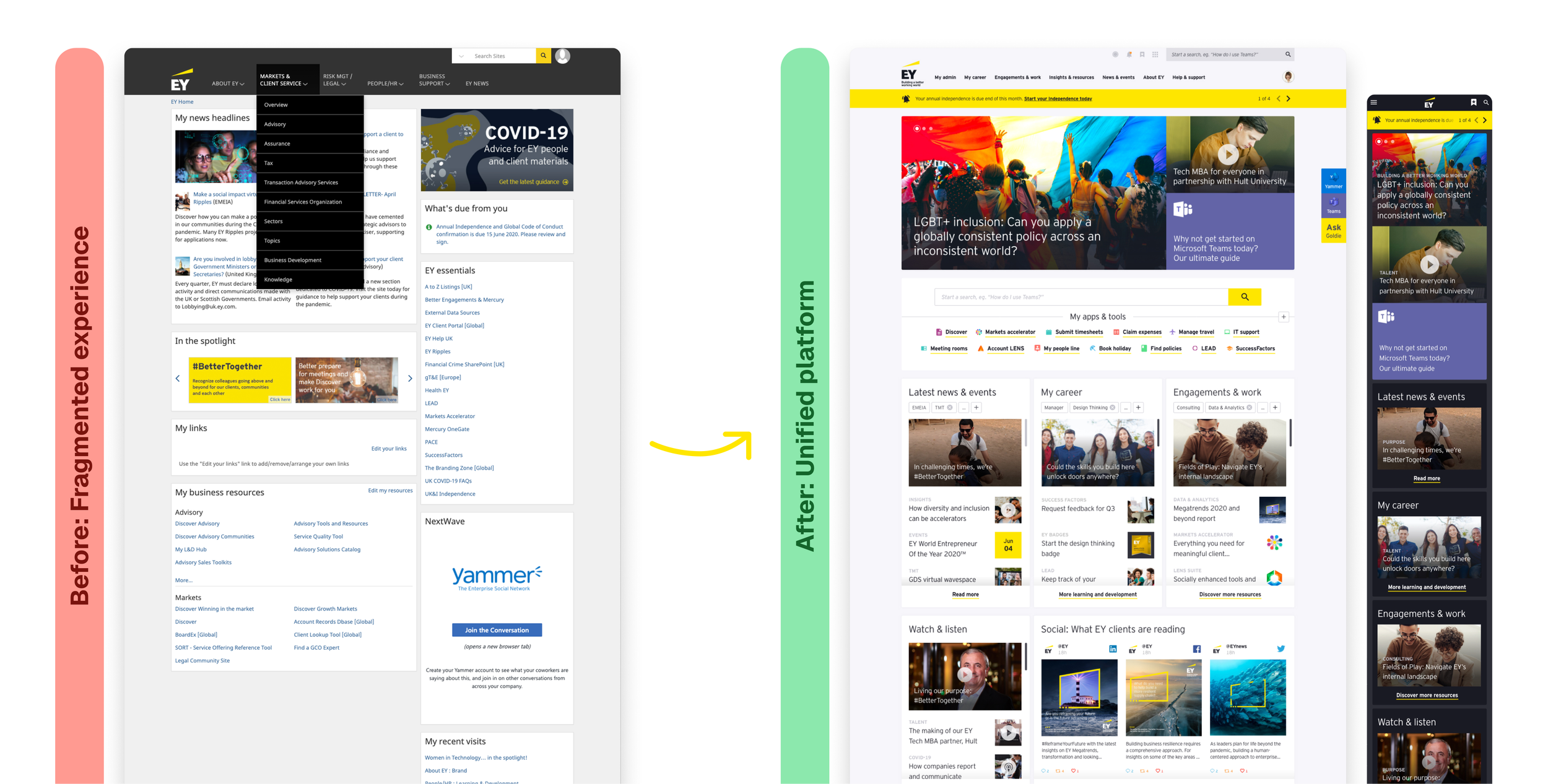
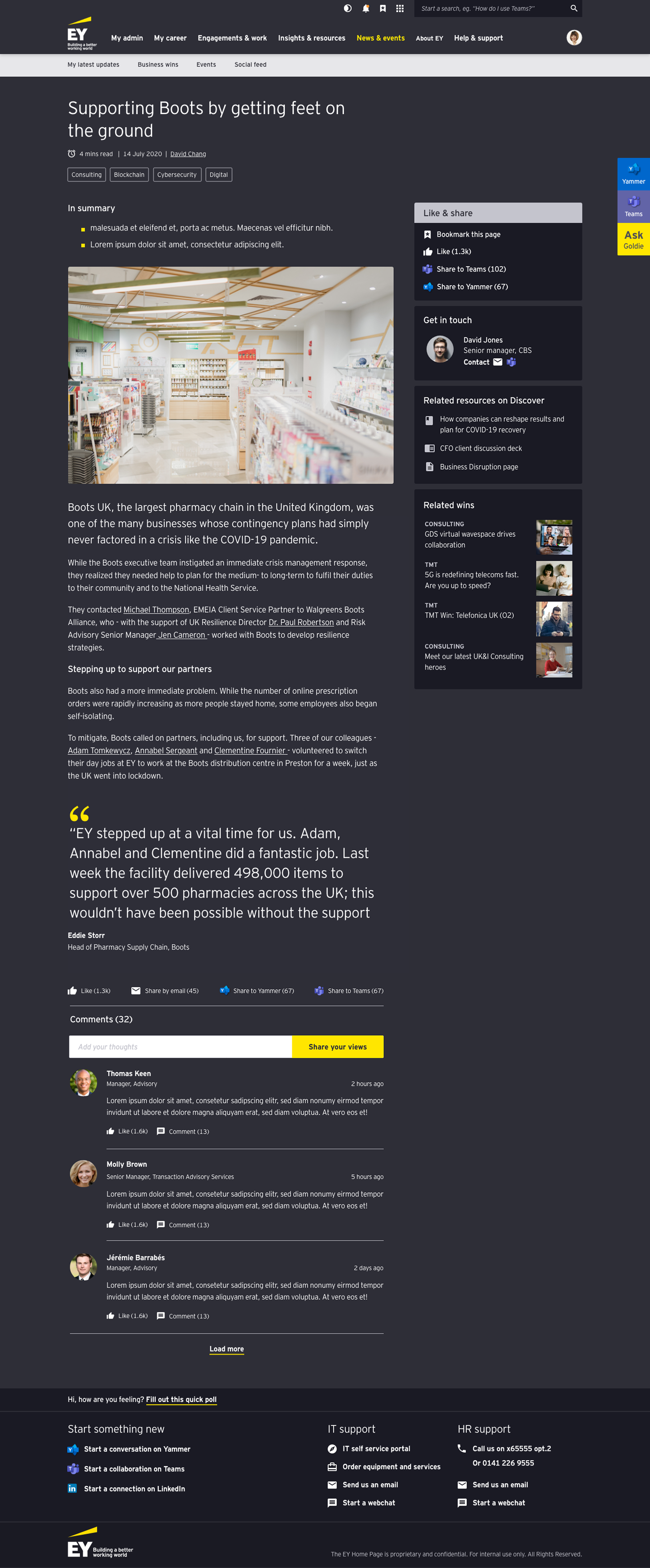
EY's existing intranet was complex, inconsistent, and widely criticised. Navigation was confusing, content lived in silos, and new joiners struggled to find basic tools without saving bookmarks. Different regions had built their own intranets, leading to duplication and disparity.
The reason this project mattered went beyond usability. EY wanted the intranet to support its NextWave strategy — helping people find what they need faster, reducing friction, and connecting content, tools and communications. Earlier redesign attempts hadn't gained traction. EY needed an approach that improved usability, instilled pride, and created alignment.
01
Findability
Content and information were hard to locate. Employees weren't confident they'd found the right thing.
02
Usability
A dated system with poor mobile accessibility. Navigation and search didn't work together well.
03
Culture
Poor employee experience impacted collaboration and connection. The intranet didn't reflect EY's brand or ambition.
04
Communications
Scattered, not personalised, and didn't balance global and local content. Regions had built their own workarounds.
Approach
Framing the Opportunity
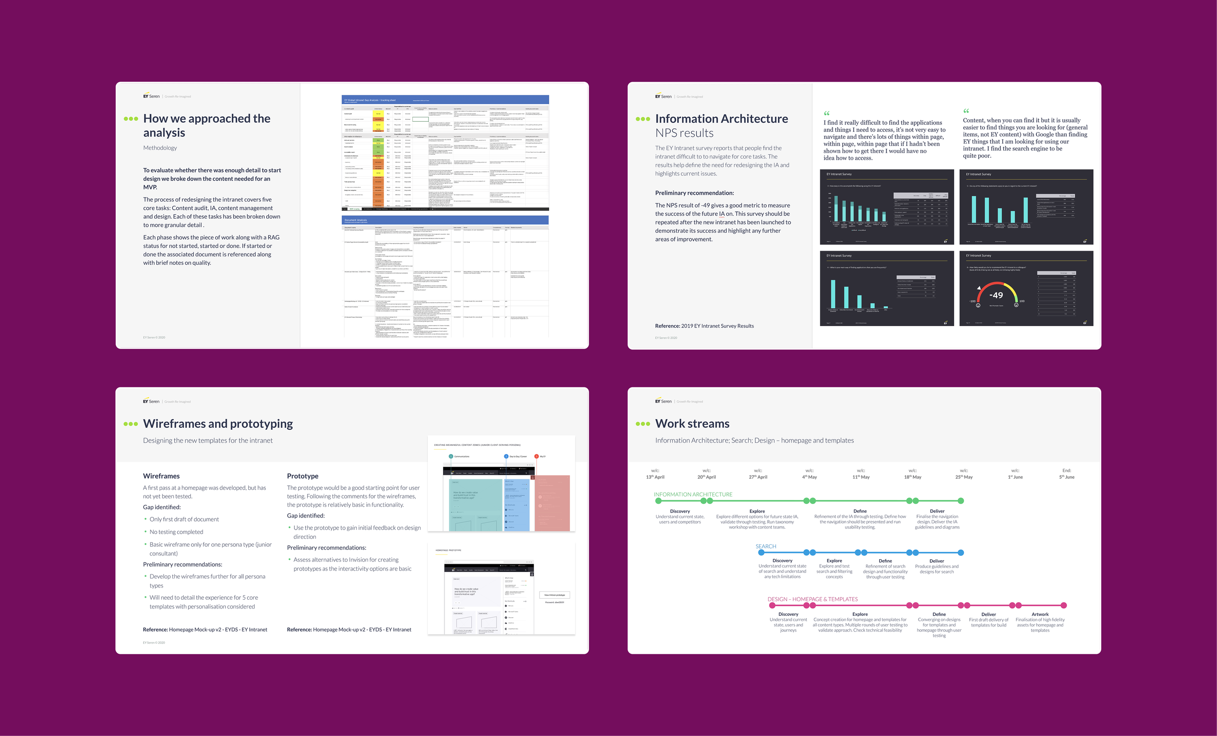
EY Seren was initially asked to review work already completed. I led a gap analysis to assess whether there was enough detail in the research, IA, and UX foundations to progress. I shaped the review around three questions: Did the existing research capture employee needs? Would the proposed IA deliver the right experience? Where were the gaps?
My recommendations created a clear structure of five workstreams — Information Architecture, Template Designs, Content Audit, Personas, and Content Governance. On the strength of this analysis, EY Seren was awarded the redesign work.
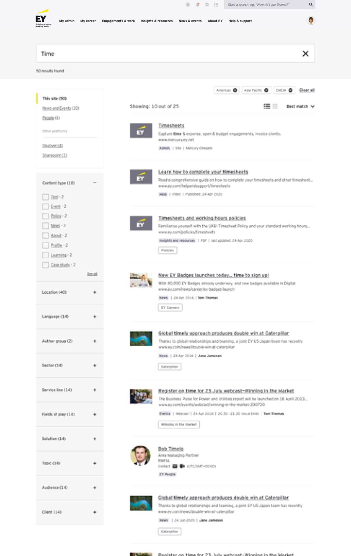
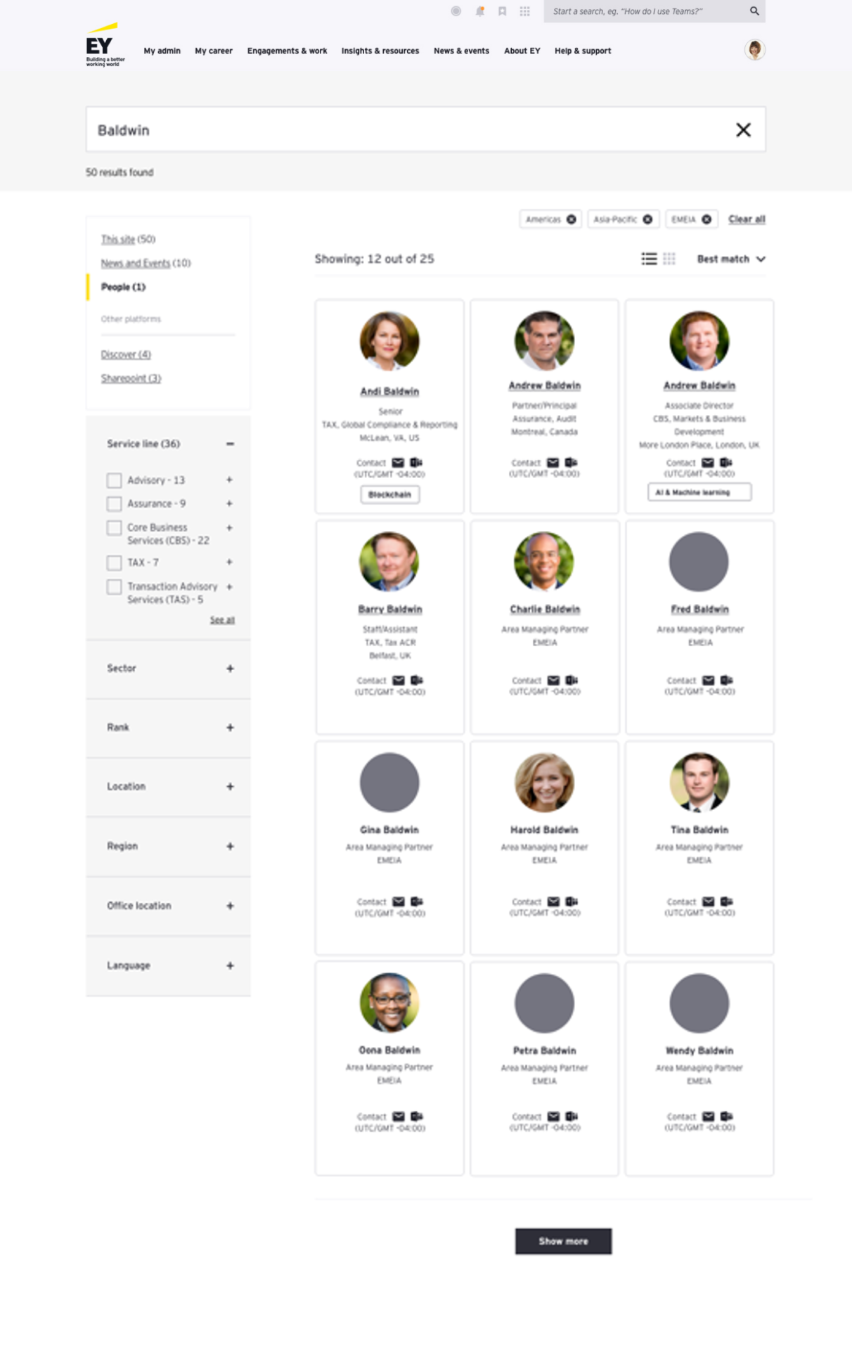
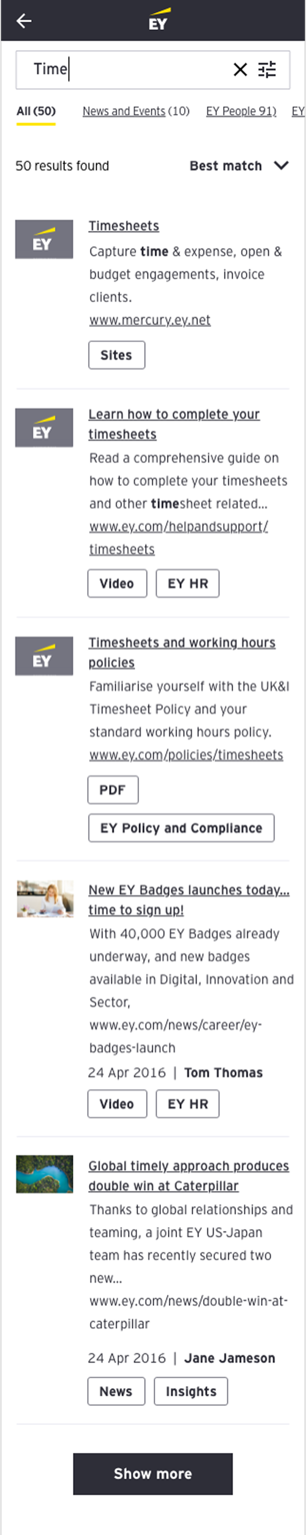
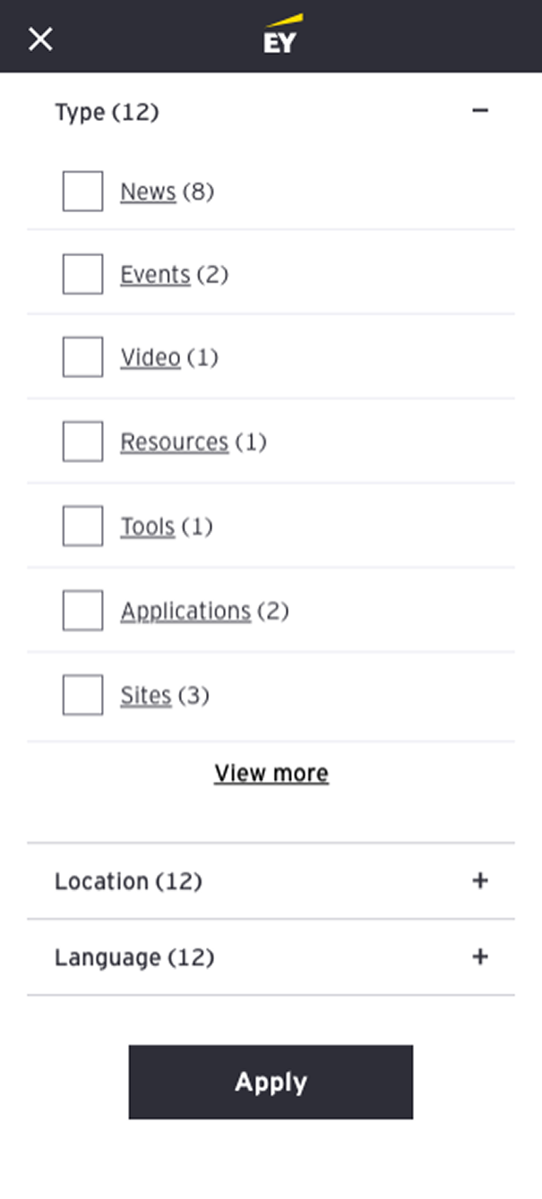
Designing the Information Architecture
To bring clarity to the intranet, I conducted tree testing with employees across markets. We benchmarked the existing IA, then iterated with multiple A/B concepts. Task success improved by 36%, while employees found the structure more intuitive and consistent.
A key recommendation was to amalgamate multiple legacy sites into a single, searchable platform, reducing reliance on bookmarks. I also introduced a framework for country variations, balancing global consistency with space for local content. This helped align regional stakeholders who had previously built their own separate intranets.
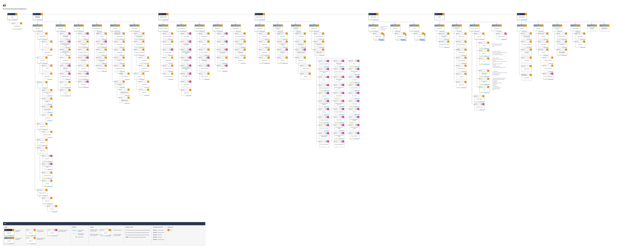
Information Architecture for a global audience. Designed to reduce emails, build awareness of EY tools and solutions, and drive efficiency.
Navigation alignment
The IA work wasn't just structural — it was political. Two tensions shaped the process, and resolving them was as important as the IA itself.
Tension 1
Local vs. global IA
Teams wanted structures tailored to local needs, but too much variation risked fragmenting the experience all over again. Some countries had different legislation, and certain content types didn't exist locally at all.
I met with regional teams, highlighted where local vs. global differences were real and necessary in the IA documentation, and created a framework that accommodated genuine variation without breaking consistency.
Tension 2
L&D alignment
L&D had strong views on content structure, and their buy-in was key to making the IA stick. They were also planning changes to their content as part of the new intranet.
I combined testing insights with an understanding of their content plans to recommend labelling and grouping that worked for users while supporting L&D's direction.
How I handled it
Evidence over opinion
I made trade-offs visible, used user-focused principles as the shared reference point, and grounded decisions in testing data. When stakeholders disagreed, the evidence gave us common ground.
This approach — presenting rationale alongside evidence and gathering structured feedback — turned potential blockers into collaborators.
Defining the search experience
Search and IA are deeply connected — both determine whether people can find what they need. I defined the filtering, sorting, and top-level results views, designing an experience where navigation and search worked together rather than as separate paths.
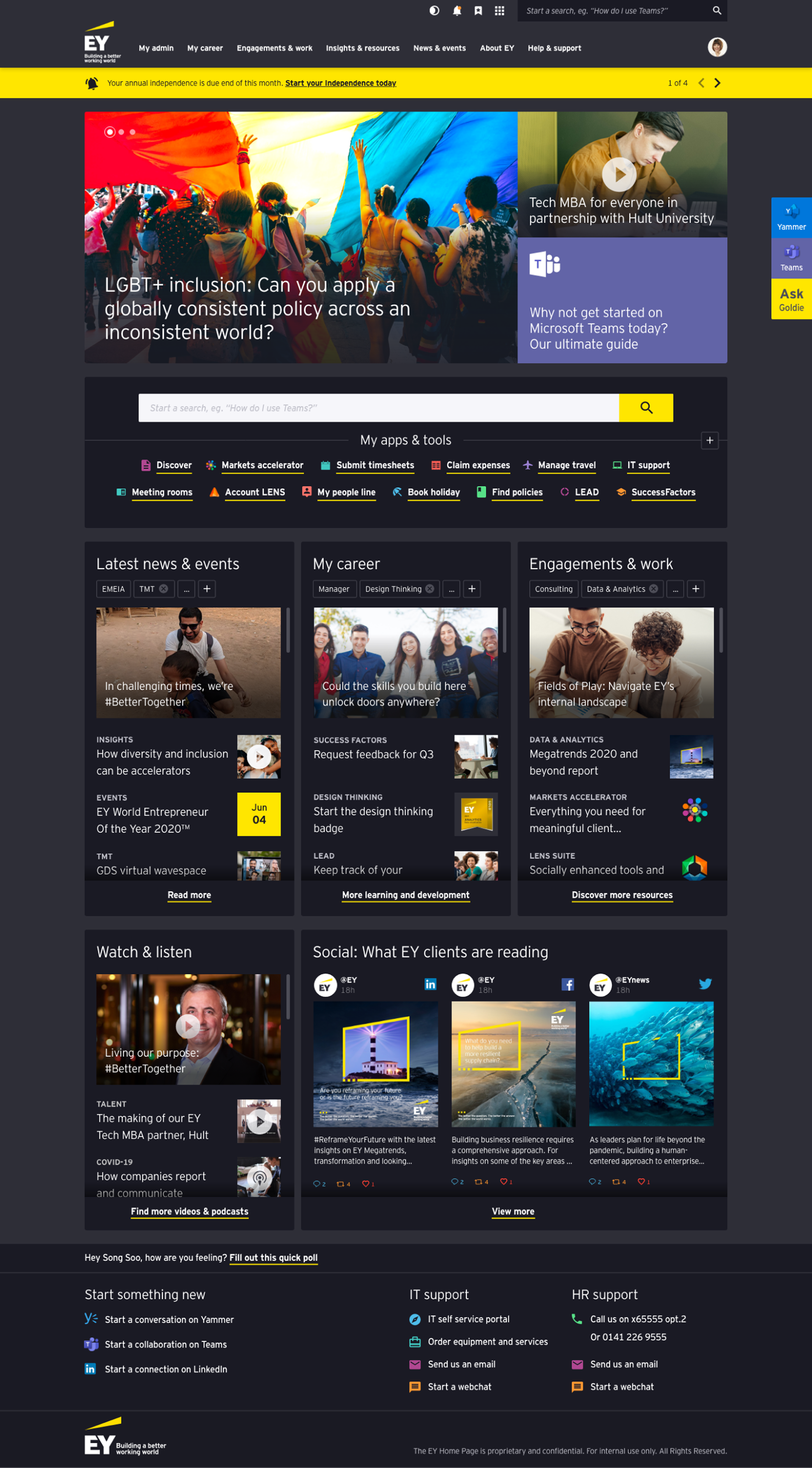
The homepage: when tested designs aren't enough
We had two homepage designs that tested well with users. Stakeholders rejected both. The feedback: too corporate, too operational, not inspiring enough. "Where's the sizzle?" was the actual question.
Rather than defending work that had tested well, I revised the design principles — elevating "surprising and delightful" as a new principle — and created three new routes. Each answered the brief differently, designed to help stakeholders articulate what they actually wanted.
The three routes were designed to answer five key questions: What's the right balance between look and feel, impact, and brand? Should the homepage signpost to content or be a destination for exploration? What content is mandatory, what's nice-to-have, and how interactive should it be?
Bold and different
Innovative design breaking intranet conventions. Consumer-like interactions influenced by Netflix and TED Talks. Greater customisation controls. Pushed the boundaries of what an intranet could feel like — but risked prioritising novelty over the utility users had asked for.
Visually impactful
A destination homepage with immersive content and bold imagery. Promoted togetherness through colleague highlights and leadership letters. Balanced utility with brand impact and culture — but the longer page length pushed key tools further down.
Focussed and streamlined
Short, utility-led, built on Unily design patterns. Each section a taster of more to discover. Every area grounded in what users said they needed. Offered "the best option" for content rather than too many choices.
Selected
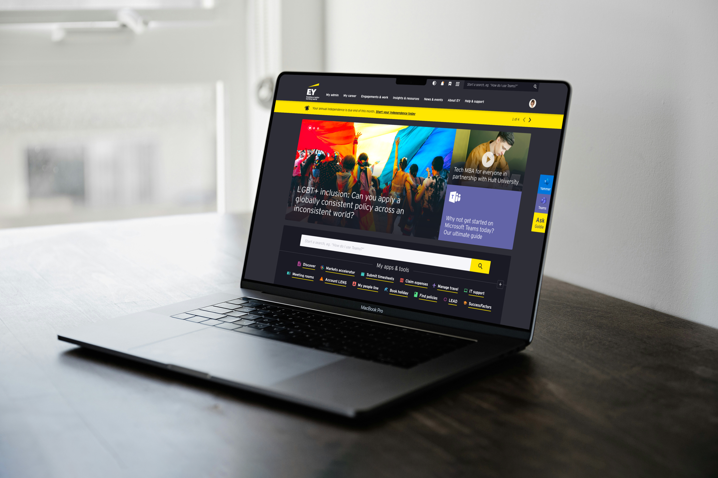
The streamlined route won. Once stakeholders saw the bolder options alongside it, they could see what they were trading off. The shorter, utility-led page gave users fast access to tools and content while still feeling modern and polished. We developed it further, and it became the foundation for the final homepage built on Unily.
Adapting to a platform shift
Mid-project, EY chose Unily as the development partner. That changed the delivery reality — designs now needed to fit Unily's component model and platform constraints. Navigation patterns, templates, homepage designs, and the scope of the search experience were all affected.
My role was to refactor the design work so it could be built in Unily, while protecting the core UX intent. The focus was on practical adjustments without losing the structural logic behind the experience.
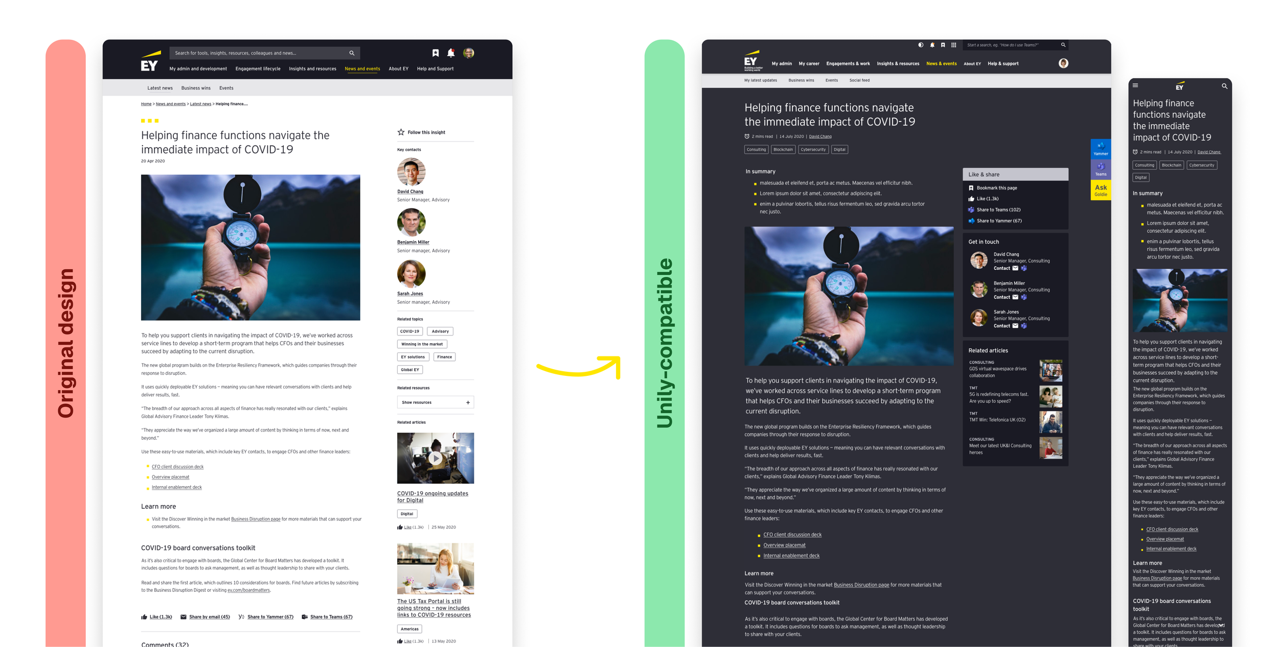
Key pages and templates
We defined the core page patterns — homepage, hubs, content pages, and service/tool pages — as a reusable system, not a set of one-off screens. The homepage acted as the launch pad; the page templates carried the deeper content and task flows. Once Unily was selected, we refactored these patterns to fit the platform's component model.


Outcomes
What changed
+85
NPS improvement
From -49 to +36
76%
Task success rate
Up from 40% (36pt increase)
1
Unified platform
From 10+ fragmented intranets
Business-critical tools elevated
Removed the need to bookmark tools and content, driving a client-centric experience.
Brand perception increased
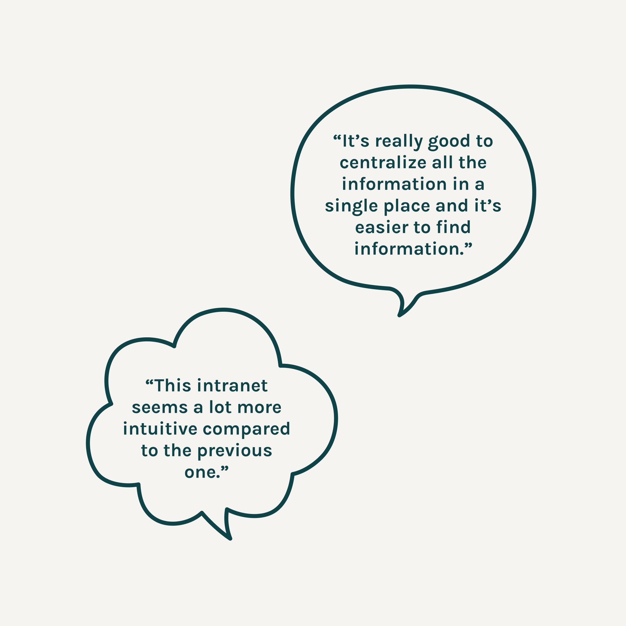
Employees found the new intranet more intuitive, engaging, and consistent with EY's brand.
Reflections
What I'd do differently
Bring regions and L&D in earlier
I'd gather feedback from regional teams and L&D earlier in the IA process to build buy-in sooner and reduce rework later.
Align platform decisions earlier
The late decision to use Unily created significant rework and made some testing outputs less useful. Earlier platform alignment would have helped us design and validate within real build constraints.
Define post-release metrics earlier
We tracked NPS and follow-up feedback, but I'd want a clearer post-release measurement plan from the start — especially for findability and search performance.
What this project reinforced
On large enterprise systems, design quality often comes from how well you structure decisions and feedback — not just from the final interface.
The IA and homepage work are good examples: in both cases, the real progress came from creating the right conversations, making trade-offs visible, and giving stakeholders something concrete to respond to.